Hyperparameters and model selection
This notebook shows how to choose shMoSeq hyperparameters and select a final model. In general, there are two hyperparameters that users will typically need to adjust:
the stickiness hyperparameter (called “kappa”), which influences the rate of switching between states
the total number of states available to the model
Furthermore, because shMoSeq is probabilistic, its final output may vary when fit multiple times with different random seeds, and this notebook also provides some ways to visualize this model-to-model variability.
%env XLA_PYTHON_CLIENT_PREALLOCATE=false
import os
import tqdm
import joblib
import numpy as np
import state_moseq as sm
import matplotlib.pyplot as plt
env: XLA_PYTHON_CLIENT_PREALLOCATE=false
1. Choosing the stickiness (kappa)
The code below assumes that you have fit multiple shMoSeq models using a range of kappa (stickiness) values and random seeds. There should be a pair of files for each model with the suffixes “state_sequence.p” and “addition_info.p”, as described in the model fitting tutorial. Each file should be named according to the hyperparameters used for fitting, as shown below. The data used in this step of the tutorial can be downloaded here; it includes model outputs for 6 values of kappa, each fit using 10 different random seeds (with the total number of states fixed at 5).
path/to/scan/outputs
├──kappa=10.0_nstates=10_seed=0-state_sequences.p
├──kappa=10.0_nstates=10_seed=0-additional_info.p
├──kappa=10.0_nstates=10_seed=1-state_sequences.p
├──kappa=10.0_nstates=10_seed=1-additional_info.p
⋮
Define scan parameters and loading functions
scan_directory = "example_kappa_scan"
fps = 30 # framerate of original videos
kappas = [177827.94, 316227.77, 562341.33, 1000000.0, 1778279.41, 3162277.66]
random_seeds = np.arange(10)
n = 5 # n_states hyperparameter
def load_state_seqs(kappa, seed):
file_prefix = os.path.join(scan_directory, f"kappa={kappa}_nstates={n}_seed={seed}")
return joblib.load(f"{file_prefix}-state_sequences.p")
def load_log_prob(kappa, seed):
file_prefix = os.path.join(scan_directory, f"kappa={kappa}_nstates={n}_seed={seed}")
return joblib.load(f"{file_prefix}-additional_info.p")["log_probs"][-1]
Load log-probability and median state duration for each model
median_durations = np.zeros((len(kappas), len(random_seeds)))
log_probs = np.zeros((len(kappas), len(random_seeds)))
with tqdm.tqdm(total = median_durations.size) as pbar:
for i,kappa in enumerate(kappas):
for j,seed in enumerate(random_seeds):
state_seqs = load_state_seqs(kappa, seed)
median_durations[i,j] = np.median(sm.get_durations(state_seqs)) / fps
log_probs[i,j] = load_log_prob(kappa, seed)
pbar.update(1)
100%|██████████████████████████████████████████████████████████████████████████████████████| 60/60 [00:07<00:00, 7.63it/s]
Plot scan results
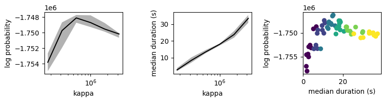
In the first two plots below, line and shading correspond to median and inter-quartile interval across model fits with a given kappa value. In the third plot, each dot represents a model colored by its kappa value.
fig,axs = plt.subplots(1,3)
# plot log probability as a function of kappa
axs[0].plot(kappas, np.median(log_probs, axis=1), c='k')
axs[0].fill_between(kappas, *np.percentile(log_probs, [25,75], axis=1), facecolor='k', alpha=0.3)
axs[0].set_xscale('log')
axs[0].set_ylabel("log probability")
axs[0].set_xlabel("kappa")
# plot median state duration as a function of kappa
axs[1].plot(kappas, np.median(median_durations, axis=1), c='k')
axs[1].fill_between(kappas, *np.percentile(median_durations, [25,75], axis=1), facecolor='k', alpha=0.3)
axs[1].set_xscale('log')
axs[1].set_ylabel("median duration (s)")
axs[1].set_xlabel("kappa")
# plot log probability as a function of median state duration
kappas_matrix = np.broadcast_to(np.log(kappas).reshape(-1,1), log_probs.shape).ravel()
axs[2].scatter(median_durations.ravel(), log_probs.ravel(), c=kappas_matrix)
#axs[2].set_xscale('log')
axs[2].set_xlabel("median duration (s)")
axs[2].set_ylabel("log probability")
fig.set_size_inches((8,2.2))
plt.tight_layout()
Choosing a final value of kappa
The plot above shows that log probability peaks when kappa=562341.33, which corresonds to a median state duration of about 13 seconds. Since 13 seconds is also consistent with the behavioral timescales revealed by mutual information (see model fitting tutorial), this peak value is most appropriate for the example dataset. In general, we recommend the following guidelines for choosing kappa.
Use the mutual information analysis from the model fitting tutorial to determine a target range of state durations
Rerun the modeling notebook several times with different kappa values. Use these runs to determine the range of values to scan over.
Perform a kappa scan, fitting 3 - 10 models per kappa value, with the candidate kappas log-spaced between their min and max values.
Using the plots above, confirm that your scan tiled the target range of state durations
Check if the log probability peaks within this target range (as in the example above). If so, use the peak value for downstream analysis.
If there is no peak (i.e. the log probability rises or falls monotonically across the full range), choose a kappas whose corresponding median state duration falls most squarely within the range defined by the mutual information analysis.
2. Choosing the number of states
The code below assumes that you have fit multiple shMoSeq models using a range of allowable states and random seeds. Model outputs should have the same format/naming as above. The data used in this step of the tutorial can be downloaded here; it includes 9 values for the number of allowable states (i.e. the n_states hyperparameter), each fit using 10 different random seeds (with kappa fixed at 562341.33).
Define scan parameters and loading functions
scan_directory = "example_nstates_scan"
fps = 30 # framerate of original videos
nstates = np.arange(2,11) # n_states hyperparameter
random_seeds = np.arange(10)
kappa = 562341.33
def load_state_seqs(n, seed):
file_prefix = os.path.join(scan_directory, f"kappa={kappa}_nstates={n}_seed={seed}")
return joblib.load(f"{file_prefix}-state_sequences.p")
def load_log_prob(n, seed):
file_prefix = os.path.join(scan_directory, f"kappa={kappa}_nstates={n}_seed={seed}")
return joblib.load(f"{file_prefix}-additional_info.p")["log_probs"][-1]
Plot state frequences
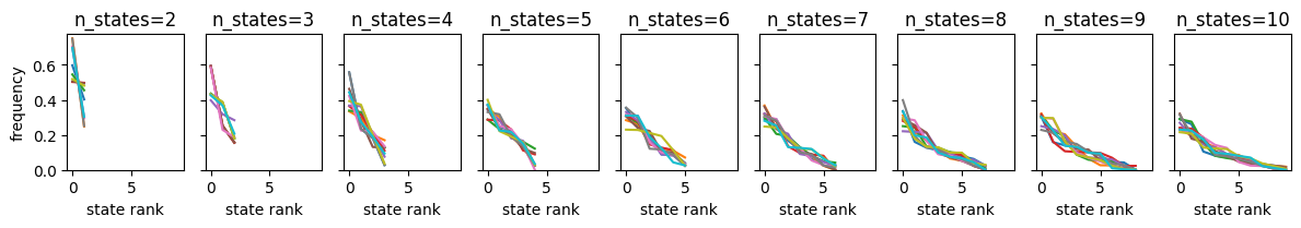
The n_states hyperparameter determines maximum number of states available to the model. However, because some of these states may occur with near-zero frequency, the effective number of states could be somewhat smaller. The plot below shows (ranked) state frequencies for each model.
frequencies = np.zeros((len(nstates), len(random_seeds), nstates.max()))
median_durations = np.zeros((len(nstates), len(random_seeds)))
with tqdm.tqdm(total = len(nstates) * len(random_seeds)) as pbar:
for i,n in enumerate(nstates):
for j,seed in enumerate(random_seeds):
state_seqs = load_state_seqs(n, seed)
median_durations[i,j] = np.median(sm.get_durations(state_seqs))
frequencies[i,j] = np.sort(sm.get_frequencies(state_seqs, num_states=nstates.max()))[::-1]
pbar.update(1)
100%|██████████████████████████████████████████████████████████████████████████████████████| 90/90 [00:13<00:00, 6.51it/s]
fig,axs = plt.subplots(1,len(nstates), sharey=True, sharex=True)
for i,n in enumerate(nstates):
for j in range(len(random_seeds)):
axs[i].plot(frequencies[i,j,:n])
axs[i].set_ylim([0,None])
axs[i].set_title(f"n_states={n}")
axs[i].set_xlabel('state rank')
axs[0].set_ylabel('frequency')
fig.set_size_inches((12,2.2))
plt.tight_layout()
Plot log probabilities
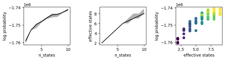
The plots above show that most states are used when n_states is less than 7, with some fall-off after that. Below, we’ll define the “effective” number of states by how many exceed a minimum frequency of 2%. The plots below show the relationship between state count and log probability.
min_frequency = 0.02
log_probs = np.zeros((len(nstates), len(random_seeds)))
eff_states = np.zeros((len(nstates), len(random_seeds)))
with tqdm.tqdm(total = len(nstates) * len(random_seeds)) as pbar:
for i,n in enumerate(nstates):
for j,seed in enumerate(random_seeds):
log_probs[i,j] = load_log_prob(n, seed)
state_seqs = load_state_seqs(n, seed)
eff_states[i,j] = (sm.get_frequencies(state_seqs) >= min_frequency).sum()
pbar.update(1)
100%|██████████████████████████████████████████████████████████████████████████████████████| 90/90 [00:09<00:00, 9.98it/s]
fig,axs = plt.subplots(1,3)
# plot log probability as a function of kappa
axs[0].plot(nstates, np.median(log_probs, axis=1), c='k')
axs[0].fill_between(nstates, *np.percentile(log_probs, [25,75], axis=1), facecolor='k', alpha=0.3)
axs[0].set_ylabel("log probability")
axs[0].set_xlabel("n_states")
# plot median state duration as a function of kappa
axs[1].plot(nstates, np.median(eff_states, axis=1), c='k')
axs[1].fill_between(nstates, *np.percentile(eff_states, [25,75], axis=1), facecolor='k', alpha=0.3)
axs[1].set_ylabel("effective states")
axs[1].set_xlabel("n_states")
# plot log probability as a function of median state duration
nstates_matrix = np.broadcast_to(nstates.reshape(-1,1), log_probs.shape).ravel()
axs[2].scatter(eff_states.ravel(), log_probs.ravel(), c=nstates_matrix)
#axs[2].set_xscale('log')
axs[2].set_xlabel("effective states")
axs[2].set_ylabel("log probability")
fig.set_size_inches((8,2.2))
plt.tight_layout()
Plot rand scores
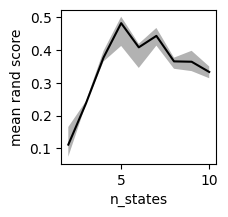
In the example above, log probability rises monotonically as the number of states increases. We must therefore use other heuristics to choose the number of states. One option is to maximize the consistency of model fitting, i.e. to choose the value of n_states that yields the most reproducible partition of timepoints. This is formalized below using average pairwise rand score.
rand_scores = np.zeros((len(nstates), len(random_seeds), len(random_seeds))) * np.nan
with tqdm.tqdm(total=int(len(nstates) * len(random_seeds) * (len(random_seeds)-1) / 2)) as pbar:
for i,n in enumerate(nstates):
for j1,seed1 in enumerate(random_seeds):
# load state sequences from first random seed
file_prefix1 = os.path.join(scan_directory, f"kappa={kappa}_nstates={n}_seed={seed1}")
state_seqs1 = joblib.load(f"{file_prefix1}-state_sequences.p")
for j2,seed2 in enumerate(random_seeds):
if j1 < j2:
# load state sequences from second random seed
file_prefix2 = os.path.join(scan_directory, f"kappa={kappa}_nstates={n}_seed={seed2}")
state_seqs2 = joblib.load(f"{file_prefix2}-state_sequences.p")
# calculate rand score
score = sm.get_adjusted_rand(state_seqs1, state_seqs2)
rand_scores[i,j1,j2] = score
rand_scores[i,j2,j1] = score
pbar.update()
100%|████████████████████████████████████████████████████████████████████████████████████| 405/405 [01:38<00:00, 4.11it/s]
median_scores = np.nanmedian(rand_scores, axis=2)
plt.plot(nstates, np.median(median_scores, axis=1), c='k')
plt.fill_between(nstates, *np.percentile(median_scores, [25,75], axis=1), facecolor='k', alpha=0.3)
plt.ylabel("median rand score")
plt.xlabel("n_states")
plt.gcf().set_size_inches((2,2))
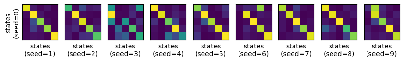
Plot confusion matrices
The plot above shows that the division into high-level states is most consistent when n_states = 5. We can visualize this directly using confusion matrices. The example data include 10 different models with with n_states = 5. The code below compares the first of these models to the other 9. Note that each heatmap is row-normalized and the rows have been resorted to emphasize the diagonal.
n = 5
seed1 = random_seeds[0]
states1 = load_state_seqs(n, seed1)
confusion_matrices = []
for seed2 in tqdm.tqdm(random_seeds[1:]):
states2 = load_state_seqs(n, seed2)
confusion, optimal_permutation, accuracy = sm.compare_states(states1, states2)
confusion_matrices.append(confusion[optimal_permutation])
100%|████████████████████████████████████████████████████████████████████████████████████████| 9/9 [00:06<00:00, 1.29it/s]
fig,axs = plt.subplots(1, len(confusion_matrices), sharey=True)
for ax, mat, seed2 in zip(axs, confusion_matrices, random_seeds[1:]):
ax.imshow(mat)
ax.set_xlabel(f"states\n(seed={seed2})")
ax.set_xticks([])
ax.set_yticks([])
axs[0].set_ylabel(f"states\n(seed={seed1})")
fig.set_size_inches((10,1.5))
Create Sankey diagrams
As shown above, some pairs of models are roughly equivalent (e.g. seed=0 vs. seed=1). In other cases, states that are split in one model are combined in another (e.g. seed=0 and seed=9). These pairwise comparisons can also be visualized using Sankey diagrams, as shown below. In each diagram, the left side corresponds to states1 and the right side to states2.
Example of agreement between models (seed=0 versus seed=1)
n = 5
seed1 = 0
seed2 = 1
states1 = load_state_seqs(n, seed1)
states2 = load_state_seqs(n, seed2)
fig = sm.plot_sankey(states1, states2)
fig.update_layout(width=600)
fig.show()
Example of disagreement between models (seed=0 versus seed=9)
n = 5
seed1 = 0
seed2 = 9
states1 = load_state_seqs(n, seed1)
states2 = load_state_seqs(n, seed2)
fig = sm.plot_sankey(states1, states2)
fig.update_layout(width=600)
fig.show()